
Revolutionary By Nature
Written by Art Director & Designer Rob Hendricks

The first step of working on a rebrand is research. Meetings with the client, reviewing the competitive marketplace, sourcing personal inspiration, etc. The results of this discovery phase can vary in terms of how tangible they are aesthetically, but they are always important. In the case of Saratoga County, it proved to be history that guided us most.
With the 250th anniversary of the American Revolution approaching, the Saratoga County government felt it was time to clean up its county seal and produce a modern brand identity and tagline that could stand beside it. With this side-by-side approach to the brand, we had to begin by simultaneously considering what would visually fit the aged style of the seal as well as what that new icon would represent about the County. It quickly came to our attention that for the new icon to be truly modern, it would have to be shape not style that brought the two together.
With the decision to go with a circular icon having been made, we turned our focus toward iconography itself. In the seal we had the history covered, so our thinking began away from what would be our eventual cornerstone. The concept that came to the foreground through our discussions with the county team and our own research was the idea of the communities and the diversity of offerings and lifestyles within the county. This ranged from agrarian to downtown, suburban to industrial, all wrapped in an abundance of green space.
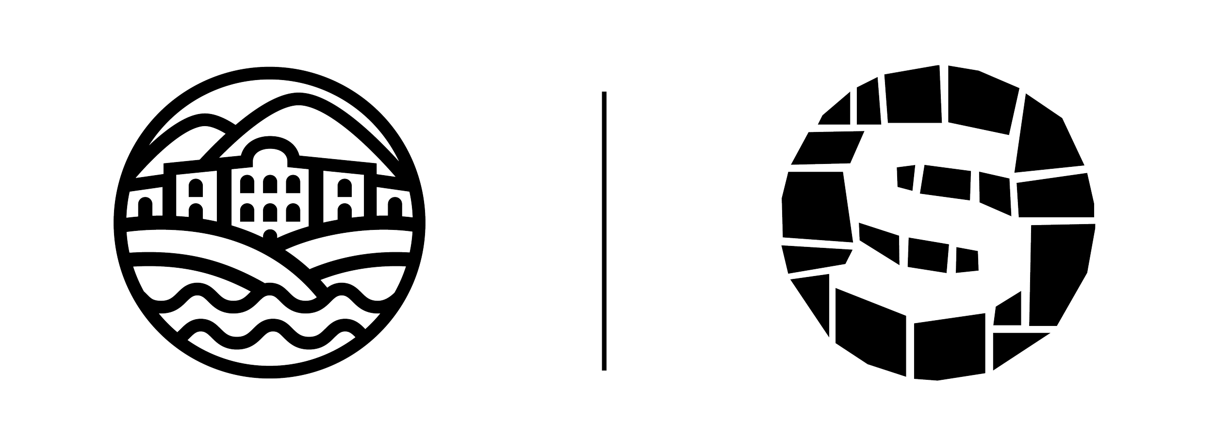
Two solutions arose: a modern monoline icon housed within a circle representing the variety of landscapes, and a mosaic “S” monogram built from 31 separate shapes meant to represent the towns, villages, and cities of the county. The mosaic approach also lent itself to the older styling of the seal. Each of these was positioned in a lock-up with a strong and bold san serif that brought an additional sense of modernity and would extend the shelf life of the mark.
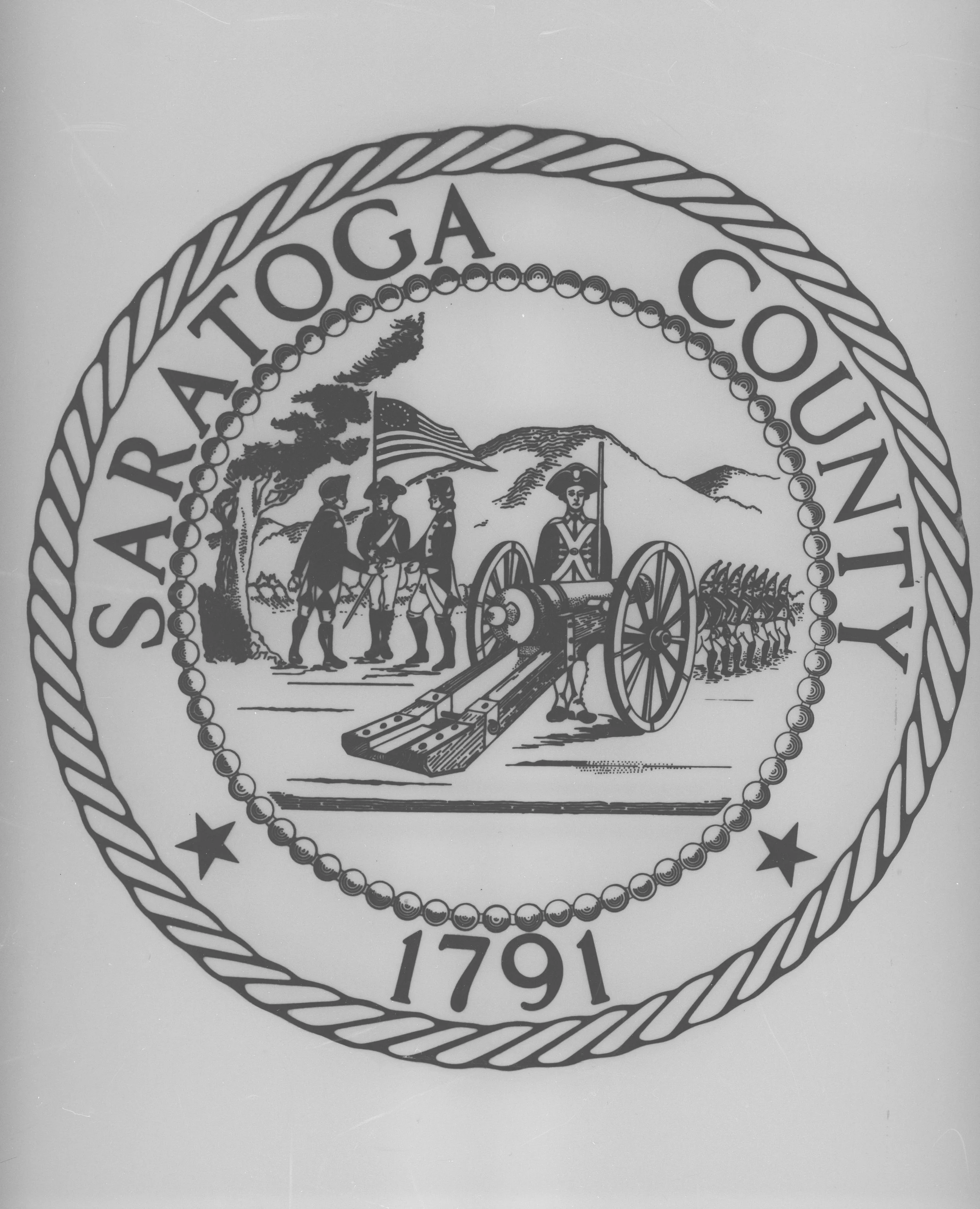
While ideating this first round of solutions, we were also working on the cleanup of the original seal. Rendered from an original drawing by Anthony Sassi in 1962, it depicted the surrender at the Battle of Saratoga. In the center is a soldier standing beside a cannon, to the left the surrender is occurring beneath a tree, and at the right a line of marching soldiers, all backdropped by mountains.
Our initial round showed options to modernize and/or restyle this mark, as well as a safe option where our focus was on simplifying shapes and smoothing some edges, but ultimately leaving the image as is.
The icon and brand options were presented together at an initial round so that the entire system was seen together from the jump. In this session, a great conversation was had around the notion that overly modernizing the seal was too much of a departure from the intentional history and professionalism the county was hoping to convey. In terms of the logo, the font hierarchy and various sub-branding options were immediately approved, however, there was not as much buy-in on the icons.
From our initial feedback, we played with some alternate options that eschewed the circle and some that riffed off of the first round, however, the ideas seemed to hold less meaning than our original round. All but one that is. The idea was an “S” icon built from a saber to reference the surrender and tie the mark to the seal. Our discussion lead us to a point where it was decided a weapon was not an appropriate primary icon, but it unlocked what would ultimately prove to be our solution.
In discussing the merits of the sword, we organically reached the notion of rearranging the seal to add prominence to the surrender itself. This focus on history and the notion of, quite literally, positioning the importance of the county at the forefront greatly resonated with the key stakeholders.

The all out buy-in on this concept lead to the decision that the rearranged seal in the prior format would continue to serve as the logo for the county in its entirety. However this didn’t feel like the step forward that all involved seemed to be looking for.
Throughout the logo process, we were also working on a tagline. Our team put their heads together on a number of ideas with the eventual selection being "Revolutionary by Nature".

"Revolution" spoke to both the obvious tie-in of Saratoga's place in the American Revolution, while also pointing toward its growth in the tech and business spaces. The "Nature" spoke to its beautiful green spaces and robust farm communities. Together this concept positioned Saratoga as both an originator and leader in the State of New York.
The juxtaposition of the new and the old within the tagline unlocked the solution to our seal vs. logo problem. What if they were one in the same?

Taking our rearranged (and simplified) seal and swapping it for our previous icons within the type hierarchy lead us to a robust and flexible system that balanced the new and the old. We were able to update a historical element of the previous mark, imbuing it with new meaning, while ultimately setting the county up with a more functional brand.
With the mark designed and tagline written, the color palette offered us one final opportunity to reference history. The primary gold and navy are informed by the county’s previous mark, however, the county was also looking for a supporting and expansive tertiary palette. The extended palette made of complimentary blues and yellows/golds, with a splash of red, was derived from the painting “Surrender of General Burgoyne” by John Trumbull. A system that ended up both tonally relevant and a nice wink to the seal itself.

In the instance of the Saratoga County rebrand, our process here at Trampoline lead us to some strong marks that we believed in but ultimately didn’t resonate with our client. That’s the game.
It was focusing on where the county has been, both its history and branding, that got us to our goal. Learning from and working with what has been established, as much as reinventing the wheel altogether, can be a successful way to lead to a strong identity. At the end of the day, it’s about what your client is representing, not always what’s new.