Under PRESSure
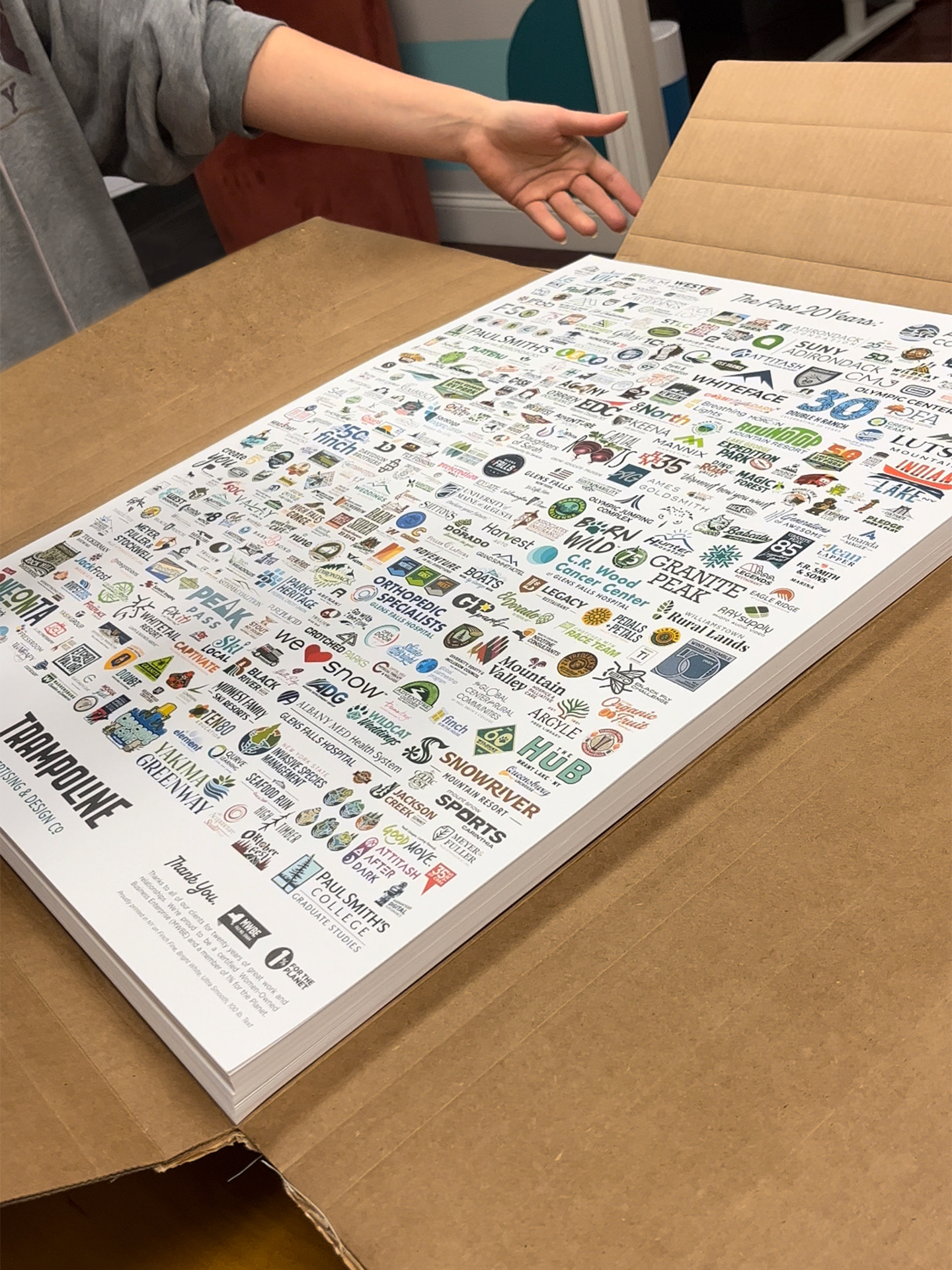
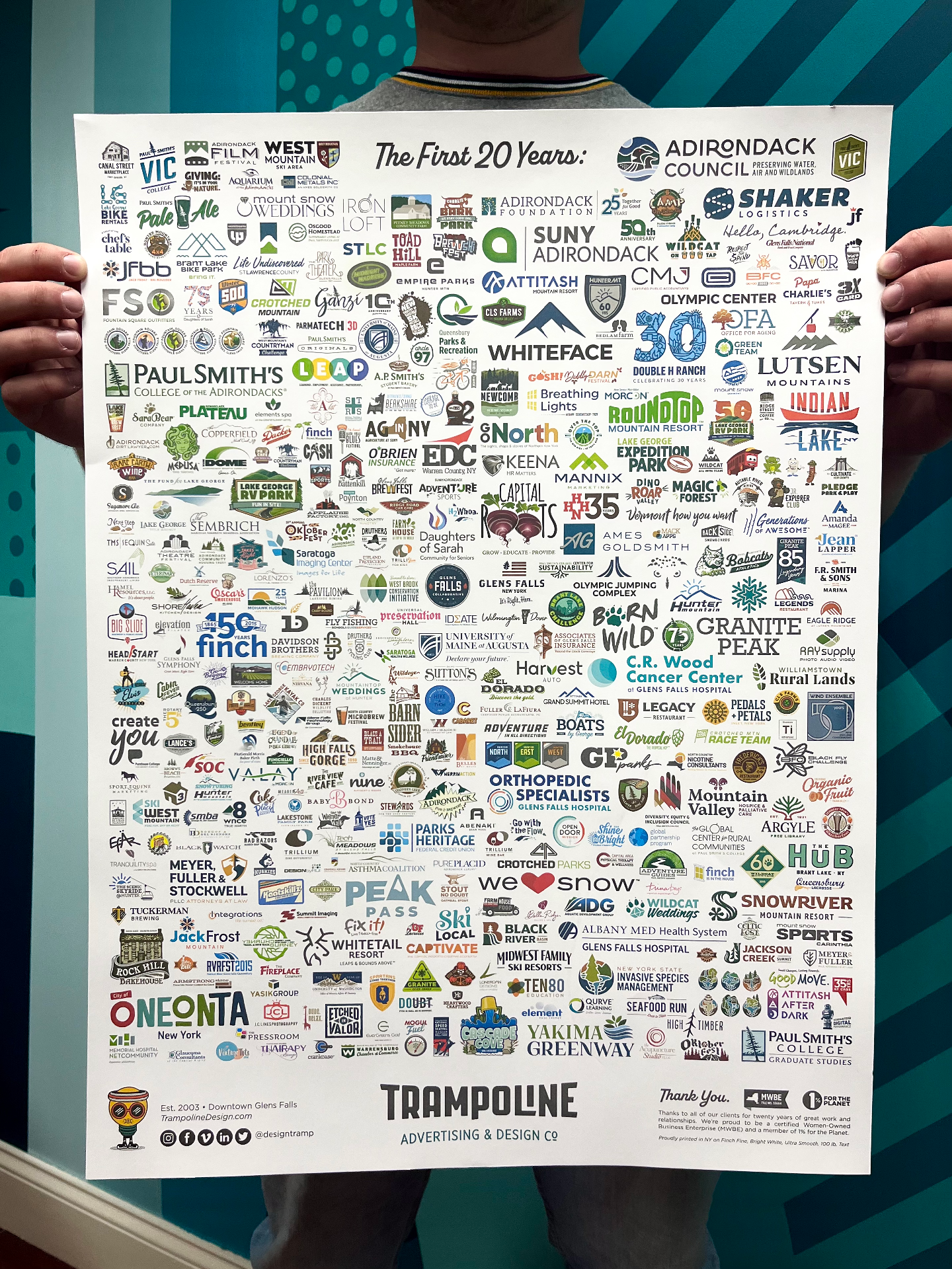
To celebrate our 20th year in business, we updated our logo poster, a piece originally created for our 13th anniversary, to highlight over 300 Trampoline custom-designed logos.
When it came time to print the poster, we took this as an opportunity to go on press and use it as a teaching moment for those on the team that have never been on a "press check." We had a great experience working with Velocity Print Solutions, located in Scotia, New York. They worked with us and made color adjustments on press to make sure we were happy with the final product.
As you could imagine, getting a poster with hundreds of logos—ours included—to print is no small task.
The press check was a great experience for our younger designers to learn more about the printing process as well as how to be best prepared for a press check. When it feels like everything is digital and remote these days, it was a refreshing change to touch paper, smell ink, and work side by side with the printer to get the best result. Check out what they learned below!

Make-ready print on top of final print: Trampoline logo close up
Understanding the printing process.
Congratulations, your project has been approved! Now it’s time to pre-press your file and send it off to print. A project printed on a traditional offset press is made up of four colors; cyan, magenta, yellow, and black (CMYK). Specialty or "spot" inks such as Pantones and metallics can also be used in place of or in addition to CMYK. Our poster was set up as CMYK. When the file gets released to the printer, their pre-press team will look over the file and create either a hard proof (always our favorite type of proof!) or a PDF proof. This is your chance to make any last-minute fixes or point out issues.
Once the proof is approved, the pre-press team will break the file down into the assigned colors. These colors are then etched onto thin metal plates and put on a roller in one of the bays of the press with the corresponding ink.
"Make-ready" is the process where the printer gets the press up and running. Make-ready paper—extra paper used to dial in the color of the press—is added and the press is run. The pressman will pull a sheet of make-ready out to see how the ink is lying and how it matches the approved proof. If necessary, color adjustments can be made to the whole page or, in some instances, in a specific area, to help it better match the approved proof. The color bars on the side of the make-ready print will be scanned with a densitometer to see how dense the ink is compared to where the pressman set it to be. This tells the pressman how the ink is going onto the paper. Once the color is approved, the press is “locked in” and the final paper is loaded and set to run. Once the ink is dry and the project has been trimmed, folded, and bound (depending on the project), it’s complete and ready for delivery.

Make-ready print on top of final print: Oneonta logo close up
Things we learned while on press:
Don’t be afraid. Press checks can be intimidating, but don’t be afraid to ask for color adjustments or ask questions if something looks off.
Be prepared. If you have a Pantone color you are trying to match, bring your swatch books for comparison.
Coated vs. uncoated. We all know the struggle of color looking different on coated paper vs. uncoated. Seeing a proof on coated proofing paper and then a make-ready print on—in our case uncoated—means that there are inevitably going to be some shifts because of how the ink sits on the paper differently. If you notice a drastic shift, call it out and see what can be done to make it more accurate.
Know what’s important. If a color adjustment on press is needed, it's important to have priorities. A color adjustment in one place may negatively affect the color in another. Know what is important to help the piece keep its integrity.
Ink Keys. Depending on where you are looking to make slight color adjustments, you may be able to adjust specific Ink Keys. For our poster we were focusing on adjusting the teal color in our logo to make it brighter. Using the Ink Keys for that area, the pressman was able to add and/or reduce the amount of a specific ink in that specific section to help us get the color we wanted.
Make-ready. Each time an adjustment was made, 70+ pages had to run through the press in order for the press to calibrate to the new adjustments. Sometimes you need a lot of make-ready in order to get the color right. The printer has to order extra paper for this process. Make-ready sheets are discarded and recycled once the press is locked in and ready to go.
Dry-back. Once the ink dries, it may appear a bit lighter. This is known as dry-back.
Short run printing. Short runs—like our poster— on a large offset press can be tricky as the press wants to run for long periods of time. When it stops for any amount of time—including during the make-ready process—the ink is allowed to thicken and water on the rollers to dry, thus affecting density, and therefore the color you may be trying to adjust. Running a press and getting continuous accurate color is a skill!