SIMPLY GARLIC
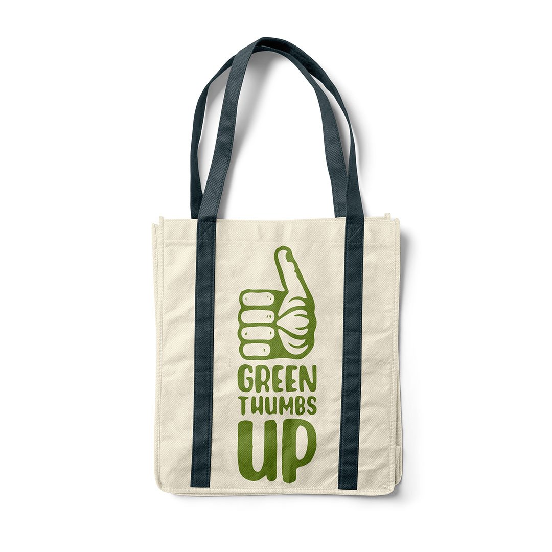
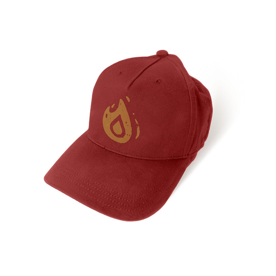
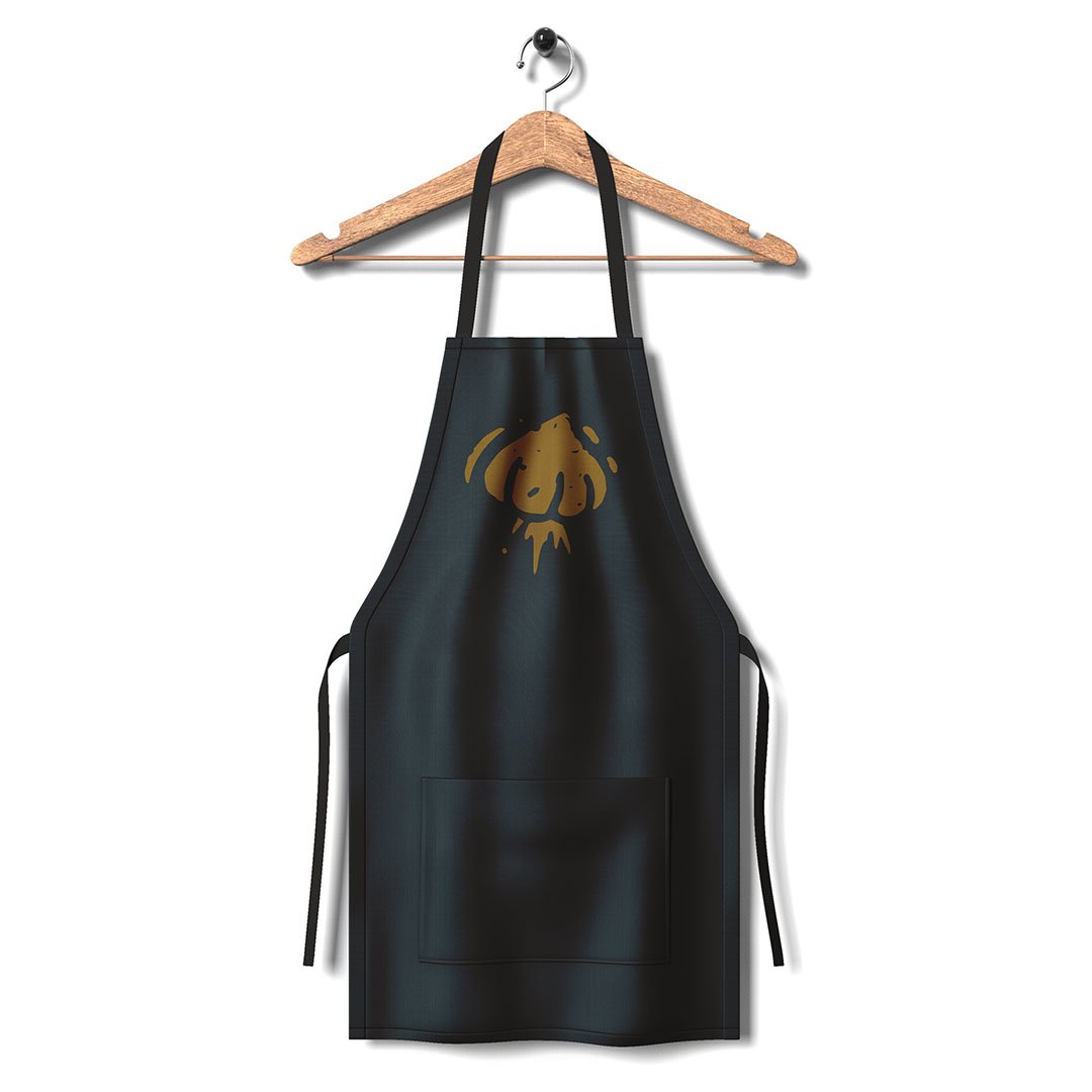
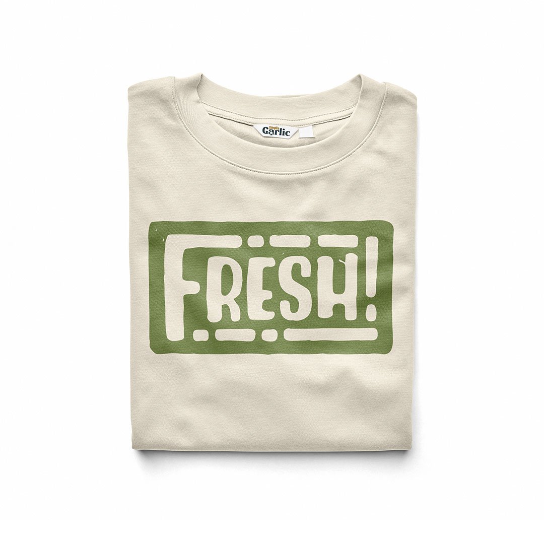
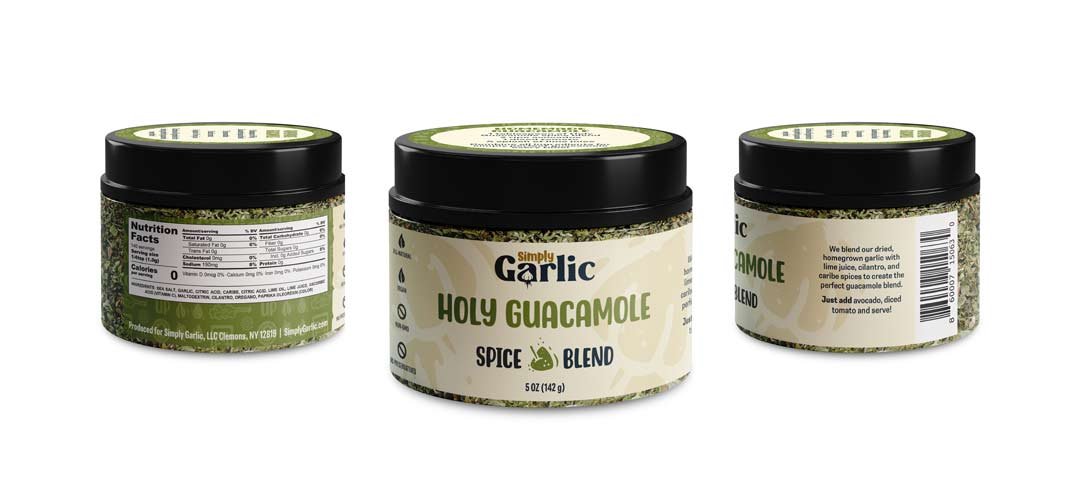
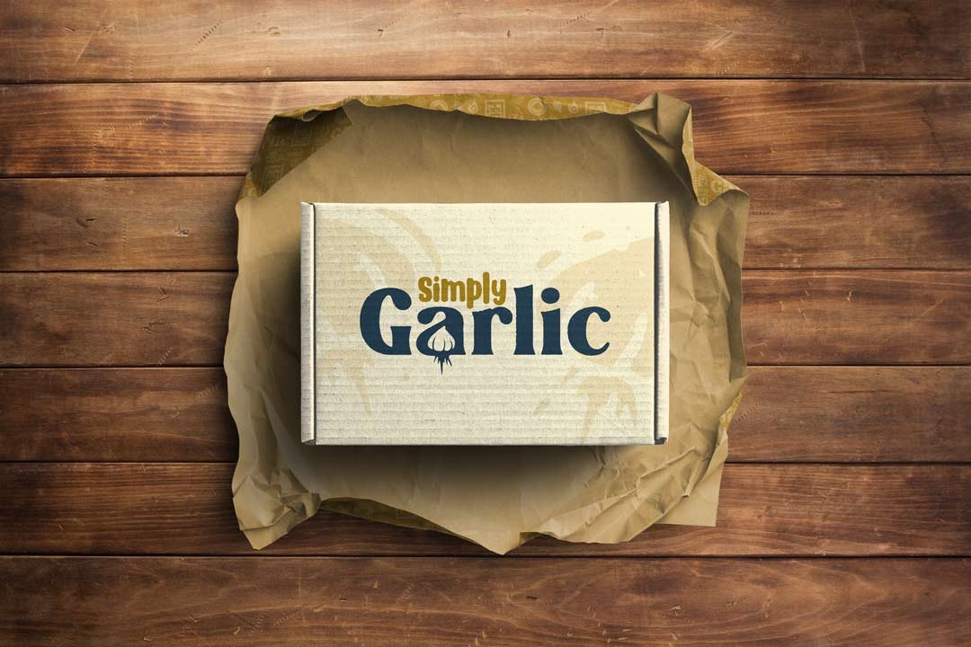
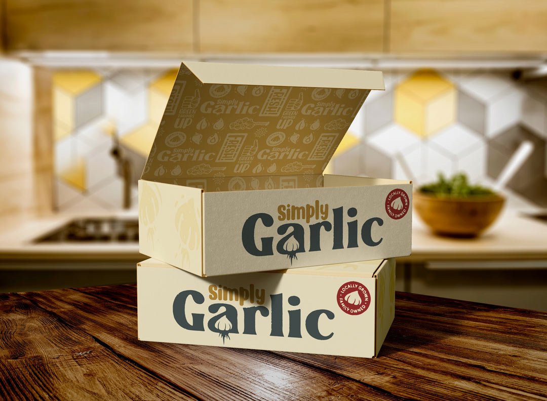
Like the green shoots of a garlic bulb breaking through the dirt in spring, a new brand identity has come to life for Simply Garlic. Boasting big flavors and fun flavor combinations, this small family farm tucked in the mountains of the Champlain Valley needed a spicy new look to stand out on crowded market shelves.
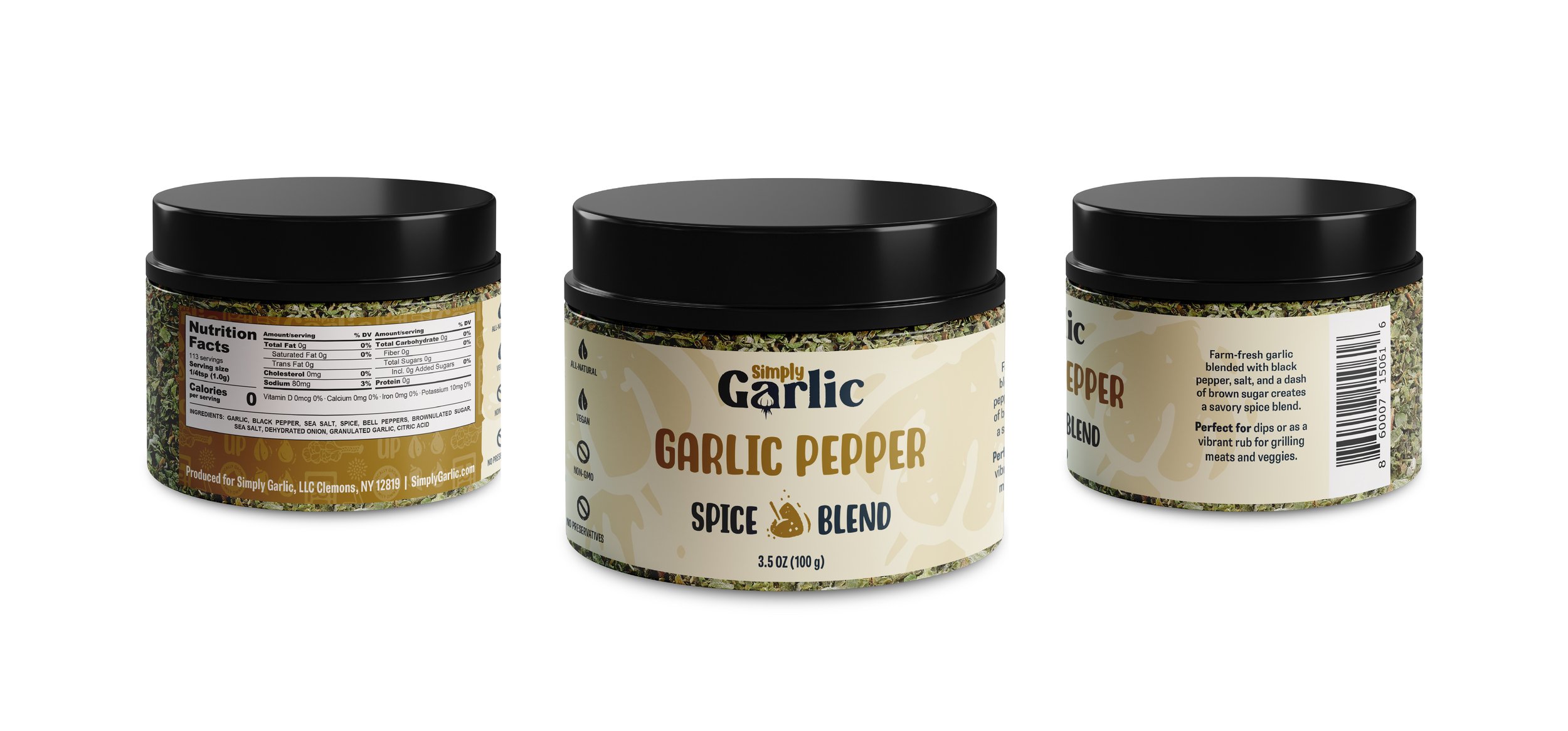
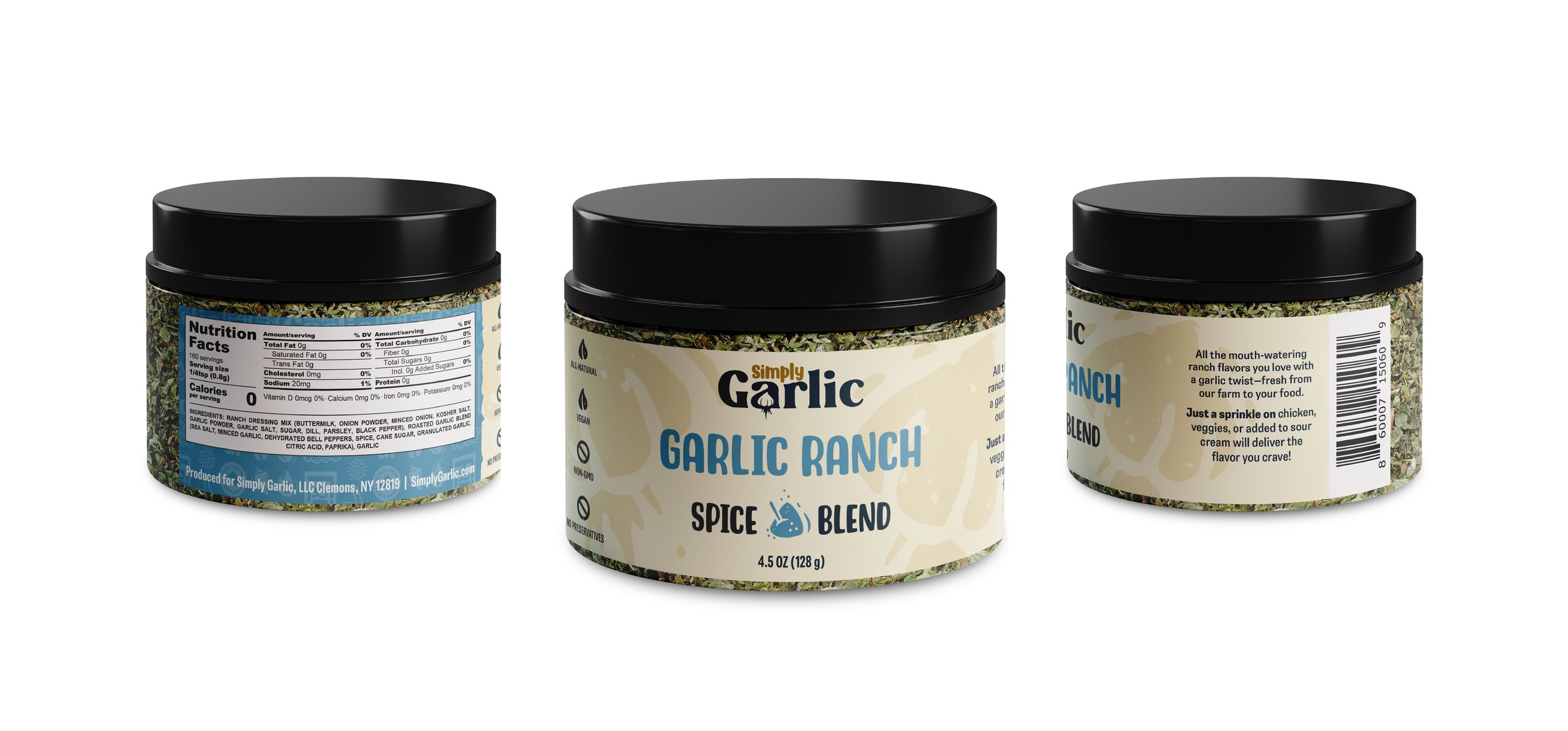
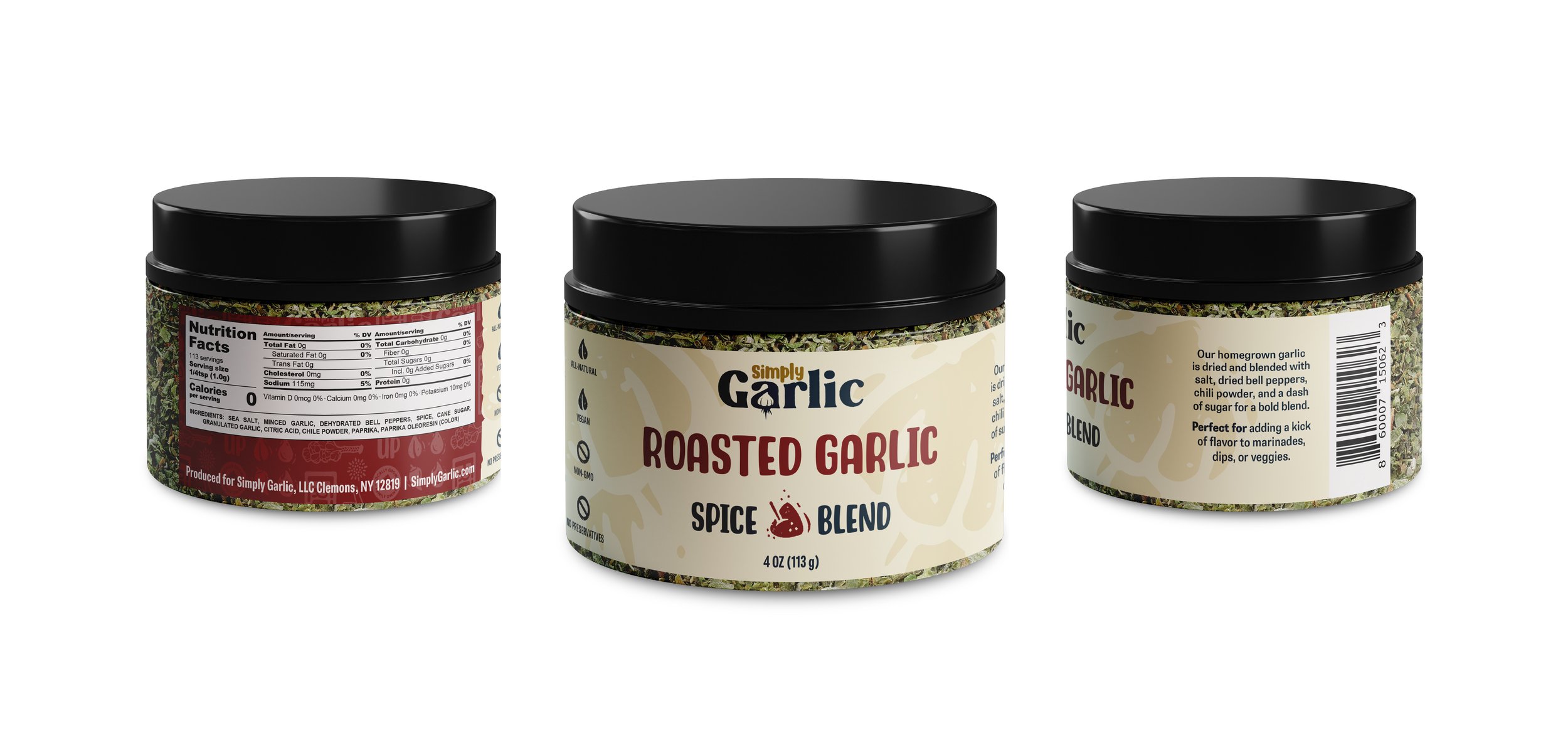
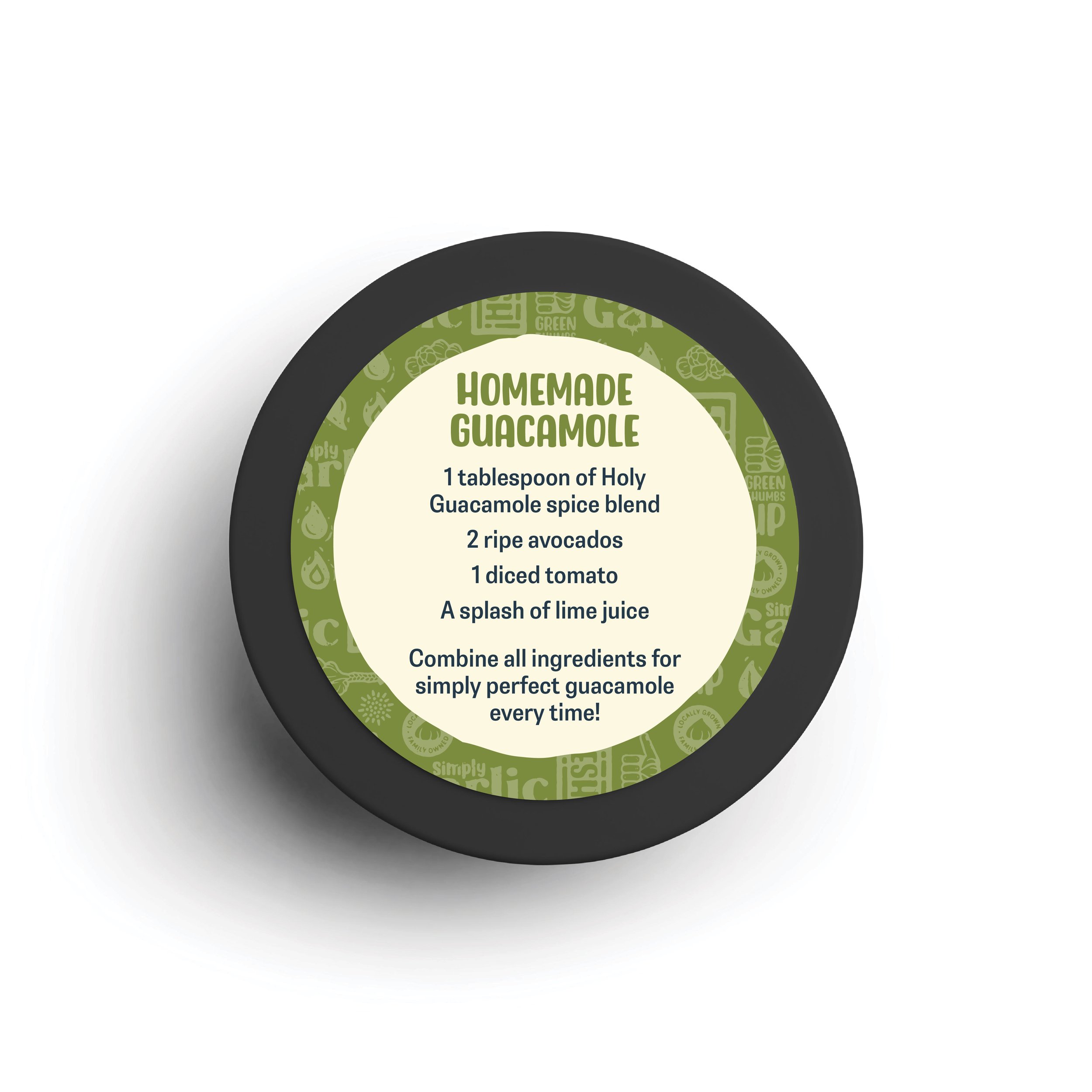
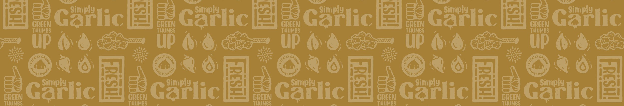
The result for the farm’s new logo is bold yet earthy, featuring playful iconography within a farm-fresh color palette. While our relationship started with a logo design and brand guide, it blossomed into packaging materials, product description writing, and label/canister design for their growing line of products.
-
Branding, Logo Design, Illustration, Copywriting, Packaging
-
Small family farm nestled in the Champlain Valley in the Southern Adirondacks.
-
Account Manager, Art Director, Brand Strategist, Creative Director, Graphic Designer, Copywriter, Illustrator, Proofreader