
Welcome MyForest Foods

SO YOU'RE READY FOR GLOW UP?
The core of what our agency does is brand stewardship, whether we create, update, or work within an existing brand. It is our duty and privilege to help it take root and grow to its fullest potential.
The process of creating or reshaping a logo requires shared vision and trust. Our team works collaboratively. We approach our work considering what will happen after the project, which is to say, our goal isn’t to complete a deliverable, it is to create sustainable momentum.
We’re also fun to work with, which we think comes through in the designs we create and the relationships we build along the way.
—
The following TestBounce™ discovery survey is brand focused to sync your audience’s expectations with the MyForest Foods brand. It also serves to bring the organization’s stakeholders and key decision makers together on the same page and set goals based on those expectations. The results will provide a solid foundation to assess future branding and marketing efforts.
**See Part II. *All form fields are required.
WHAT ARE THE NEXT STEPS?
A brief overview of key steps for a logo design process:
-
You Have Homework! It's TestBounce Time: Consolidated written feedback/answers are submitted to Trampoline.
TestBounce Results Review & Discussion
Let's chat through your answers! Your team and Trampoline will meet to review and discuss each answer to kick off the creative process. Hearing from your key decision-makers directly is an invaluable step in our process before pencil hits paper. -
Round 1 Presentation: Black & White
You can expect a Round 1 presentation to be in black & white. We want to make sure you are happy with the logo in its simplest form before color is introduced.Round 1 Consolidated Feedback:
Ideally, we're looking for your team to provide feedback that can narrow down the logos presented to your top one or two favorite directions for the next round. -
Round 2 Presentation: Refinements & Additional Marks
You can expect this round to address feedback provided from the Round 1 presentation.Round 2 Consolidated Feedback:
Together we'll establish a single direction to carry into the final round. -
Round 3 Presentation: Final Refinements & Color
GET EXCITED! We should be in the final stage of refinements and ready to introduce color options.Final Consolidated Feedback:
This step is for final decisions on the logo and colors.Now is the time to start thinking of branding in application if contracted; brand standards, typography, collateral, merchandise, etc.
-
Final File Preparation & Release:
THEY'RE HERE! Don't worry—we won't dump a bunch of files on your lap. We'll walk you through what you'll be receiving.
TAKE YOUR TESTBOUNCE
— PART I —
This is a custom TestBounce form for MyForest Foods.
Please provide responses as consolidated written feedback from your chosen stakeholders and key decision makers.
— PART II —
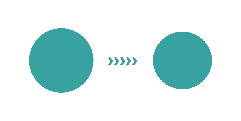
UPDATE
Only minor updates please! I don't want anyone to notice any major differences. Just looking to clean up the current logo to be able to reproduce it better and to have a vector (scalable) format.
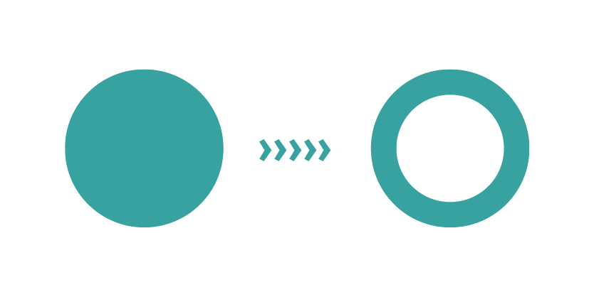
REFRESH
Lots of good things are working—but the logo needs some help. There are key elements that should be maintained during this evolution, but open to exploring what we could remove/alter to make the logo work for our new goals.

REDESIGN
It's time for something new! We have new goals for our organization. It's time for our logo to reflect where we're headed.
Logo redesign is a journey and an evolution. We're here to talk things through and provide our expertise to guide you where we can. We'll work together to achieve your goals and also provide insight into why some elements might work, while others don't. As we work through the process, try to avoid directly comparing your new logo options to your old as a measure of success. Instead, focus on how the new logo represents your brand and/or speaks to you, your business, and your customers. Change can bring unexpected emotions—whether that’s excitement about something new or anxiety about changing too much. That's why we complete the TestBounce, to help you ensure that you are making a change for the right reasons.
— APPENDIX / FAQs —
-
Depending on the extent of your project and feedback turnaround time, an average logo design can take 3+ months to complete.
-
You can expect a Round 1 presentation to include up to three (3) options based on your TestBounce answers and our discovery phase.
-
This helps streamline our process—and it is invaluable for our design team to hear directly from all key decision makers together at one time.
-
A logo refresh is adjusting the current logo with only minor changes (color palette, simplifying, etc.). A redesign is a more complex process that usually involves new goals for the organization which are best served by an entirely new approach to the logo.
-
Yes, 100%. Let's connect and we'll work together to develop both internal and external communication strategies for your new logo rollout through an additional scope of work.
-
Branding isn't just about the logo. It's how the logo is applied to all collateral, campaigns, videos, infographics, copywriting, etc., in addition to typography, color palette, voice, tone, etc. Are you ready to jump in?
-
Your logo suite will include vector, print, and web-friendly files; CMYK, Black, Knockout, and RGB; a brand standards guide to assist with usage best practices; the scope of the guide will be determined in your contract; this will cover all modular forms of your logo system (as applicable): icon, stacked, horizontal, and any additional responsive elements.
(See below)
-
Give us a call or shoot us an email! We're here for you.
ICON-ONLY
STACKED
STACKED WITH TAGLINE
HORIZONTAL
HORIZONTAL WITH TAGLINE
SIMPLIFIED ICON FOR SMALLER APPLICATIONS (IF NEEDED)