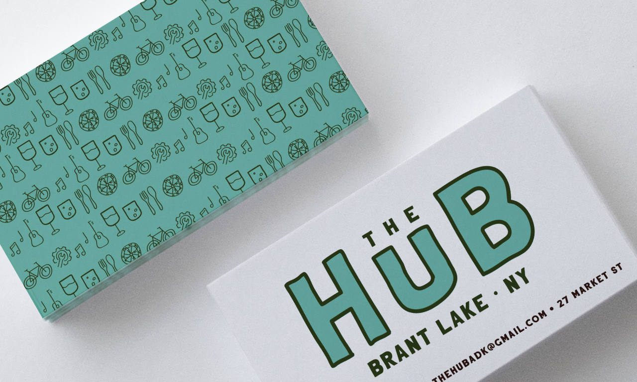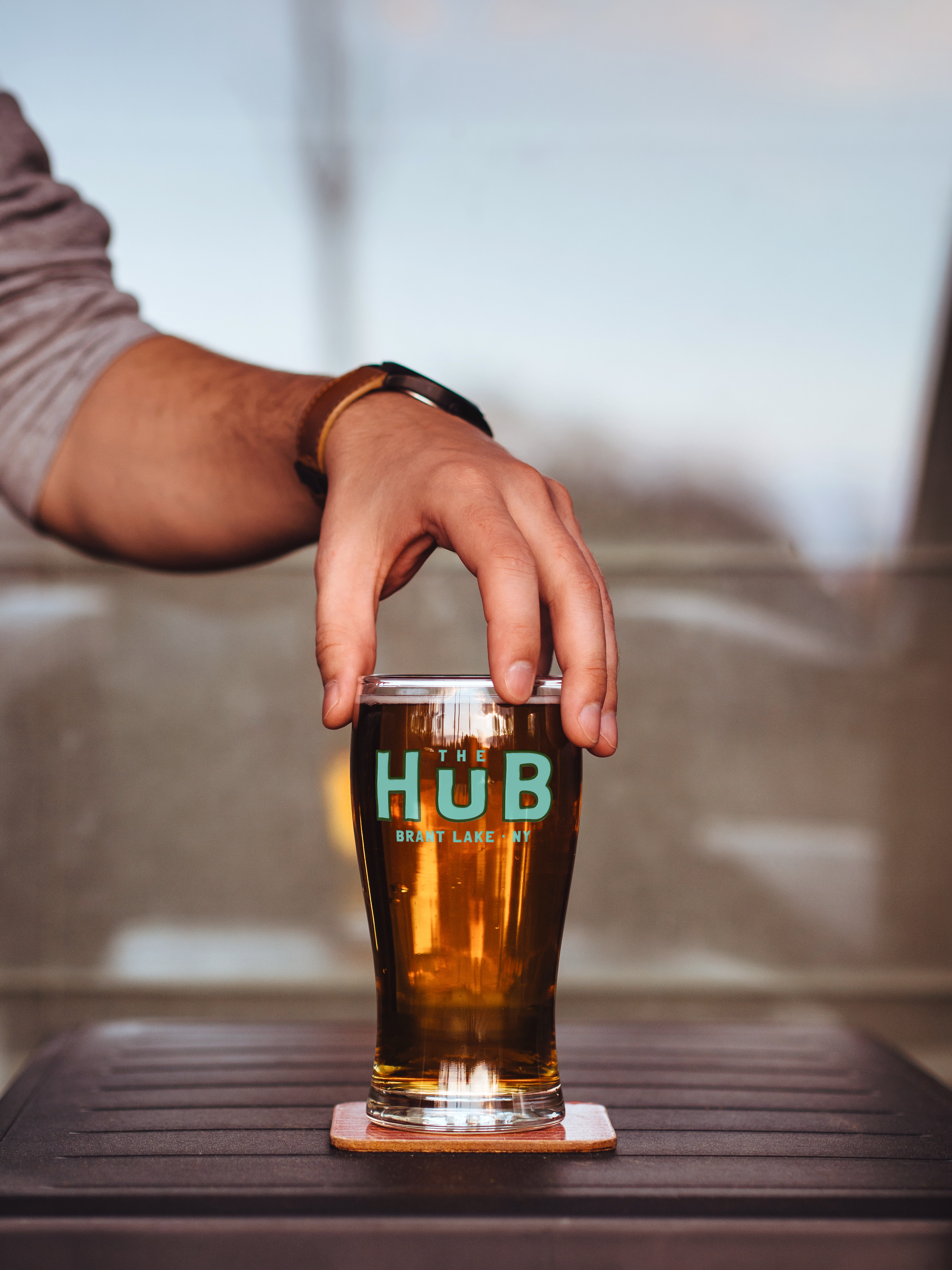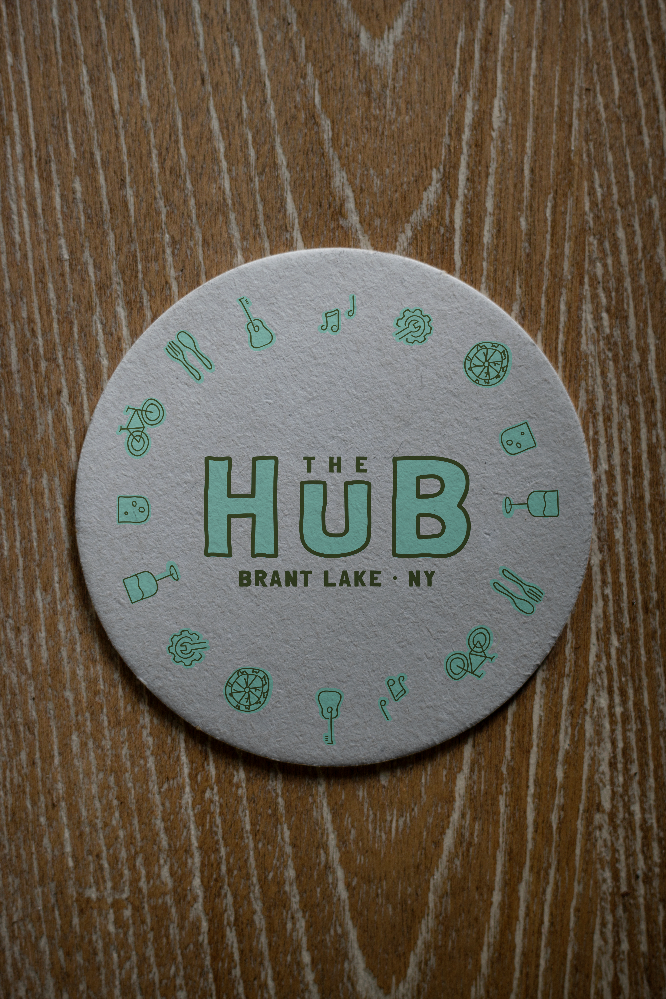
THE HUB
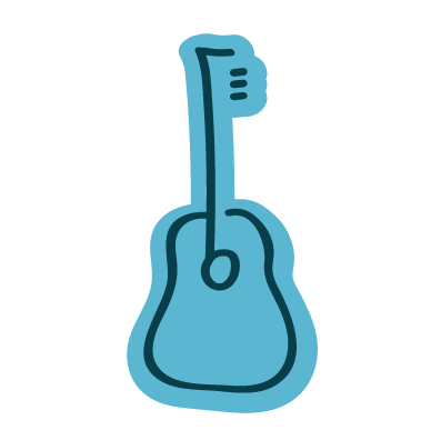
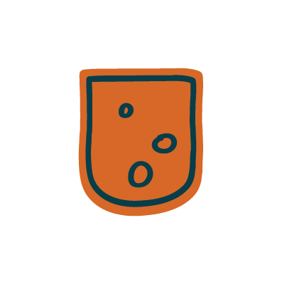
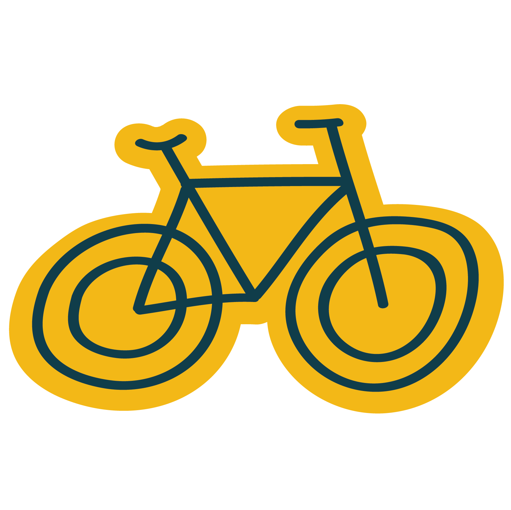
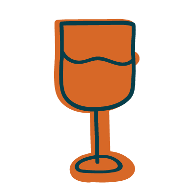
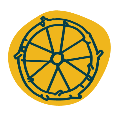
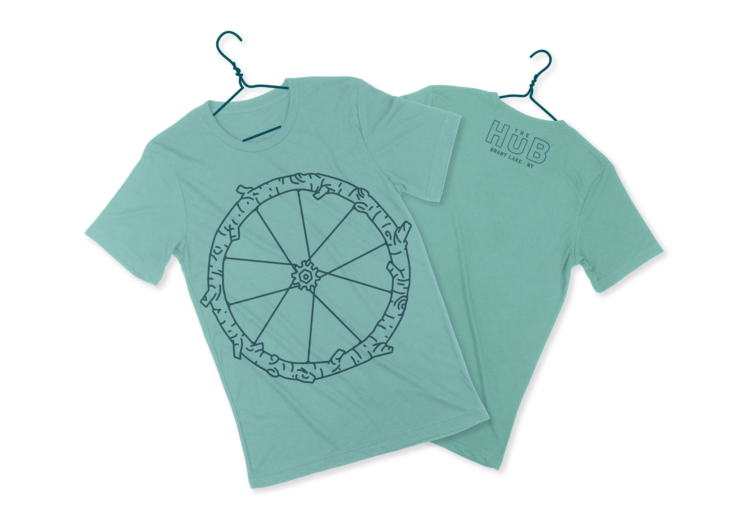
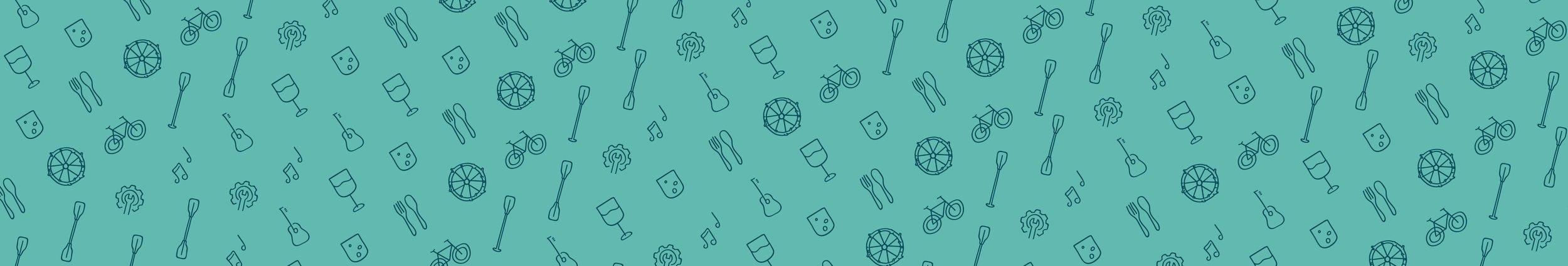
A growing business with a big personality, The Hub in Brant Lake was ready for a more professional brand that would retain its unique style and outdoorsy character. With key elements of cycling, food, and entertainment at this restaurant/bar/bike shop for the “sweaty, hungry, and thirsty,” we wanted to use iconography, updated typography, and colors to create a simplified logo that brings this triple-threat brand to life.
The final product, inspired by the large H-U-B letters on the front of the building, reflects the bright and eclectic style of the business in a way that can be represented and showcased throughout the community.
-
Branding, Collateral, Signage
-
Restaurant and Bicycle Shop in Brant Lake, NY
-
Account Manager, Art Director, Brand Strategist, Creative Director, Graphic Designer, Illustrator, Proofreader